The dashboard is the first page you will see after log in.
This page will give easy access to the most important data.
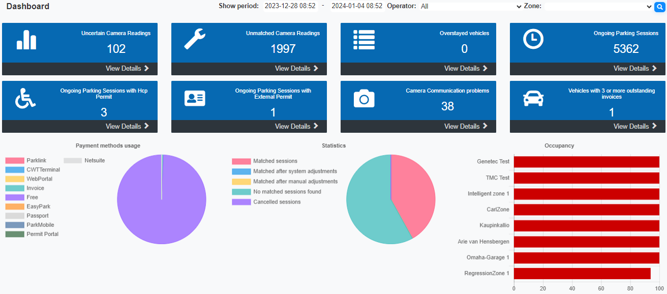
•The first part between the header and the Dashboard buttons contains drop-down list boxes. The number of boxes depend on the user configuration.
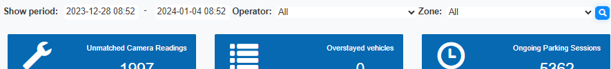
oThe "Show period" area has 2 date-time selectors
▪Select the Date from and then optional a time for that date. This defaults to the last 7 days from the time you opened this page.
▪Then select the end date. This field defaults to the date and time you opened this page.
▪After setting the dates, you must click the [filter  ] button to apply the filter.
▪If both the start and end date are left empty, all transactions are accounted for. This may cause a time out.
▪Clicking a button to a pre-filtered page like the uncertain camera readings will apply the selected dates to that page if applicable.
oThe next list box contains all operators assigned to this account.
See Add User Account for details on adding operators to accounts.
Selecting "All" from the drop-down list will show data for all the operators assigned to the account.
If no additional operators are assigned only the "All" option will be available.
oA third list box allows you to select a zone. When "all" operators are selected, all zones for these operators are listed.
The selected zone will be pre-set on all pages that have a zone filter.
•The second part contains links to pre-filtered pages with the most important information.
Click on a page image to go the page details.

Figure 11: Dashboard
•The third part contains 3 graphs:
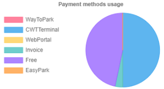
othe left one depicts with a pie chart the payment methods used. Hoover over the chart to see additional data.
oThe middle one depicts with a pie chart statistic about the level of match between in and outgoing camera readings. Hoover over the chart to see additional data.
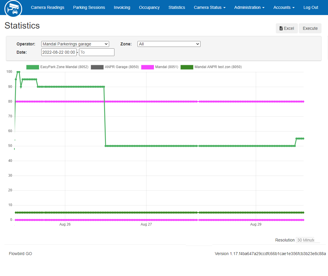
oThe right one gives an overview of the used payment methods and the Occupancy per zone. Hoover over the graphs to see additional data.
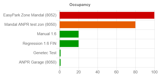
Clicking the Occupancy graph will take you to the Occupancy page showing the current occupancy state.
The Occupancy graph uses the following colours:
xx |
xx |
xx |
xx |
xx |
xx |
xx |
xx |
xx |
xx |
▪0-70% green
▪70-90% orange
▪more than 90% Red colour.