Each of the widgets is equipped with tool-tips that appear when you hover your mouse over a chart or trend. For example:
•Display details hoovering over graphs
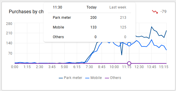
Hoovering with your mouse over a data point in a graph will display a pop-up with data for all lines for the selected time slot.
•Clicking the title of the widget will display a table view of the data in the widget.
| Note that the data is filtered in the same way as the widget itself. |
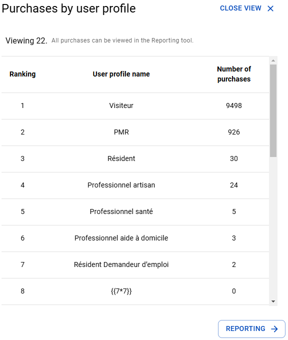
Clicking the [reporting->] button will bring you to the analyses tool.
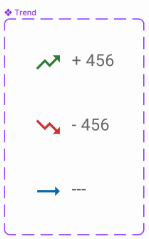
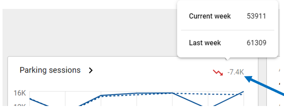
•Hoovering over the Trend will display a pop-up displaying the current and previous period figures.
•The trend label can be displayed in three ways:
oGreen: Indicates a “Trend Up” (increasing activity).
oBlue: Represents a “Trend Flat” (neutral activity- same result).
oRed: Indicates a “Trend Down” (decreasing activity).