When you enter an analysis function, an empty workspace is presented:
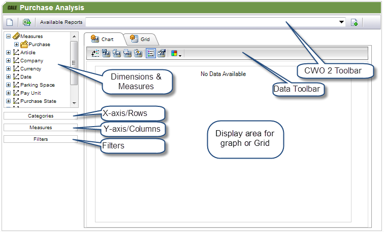
The analysis function contains the following areas:
Area |
Explanation |
|---|---|
WebOffice Toolbar. |
The toolbar is used to select different stored reports, to save and schedule a report. |
Data Toolbar. |
The Toolbar is used to manipulate the current report. |
Dimensions & measures. |
The top-left area displays the available measures and dimensions. Items can be dragged from this area into the other areas. |
Graph/Grid. |
The report is displayed either as a Graph or in a grid. |
Categories. |
Corresponds to the x-axis in Graphical mode or rows in Grid mode. Dimensions are dragged to this area to display the members. |
Measures. |
Measures are normally placed here, but more generally, the area corresponds to the y-axis in graphical mode or columns in Grid mode. Dimensions can be placed in this area as well. |
Filters. |
Dimensional filters are placed in this area. This filter will not affect the layout of the chart or grid. |
The following table describes the meaning of each button in the WebOffice toolbar:
Button |
Explanation |
|---|---|
|
Clears the display area for you to create a new analysis report. |
|
Opens the export pop-up. This pop-up allows you to export the data (not the graph) to Excel 2003, Excel 2007 or later and to PDF. The export is for Excel limited to 65000 rows. |
|
Open the Analysis Report pop-up that allows you to save the current analysis report as a new report or scheduled report. Next time you visit the page you can select the report from the list box top left. |
|
Saves the current report. |
|
Opens the Analysis Report pop-up with the current settings. This pop-up allows you to change the setting of an existing report or schedule. |
|
Deletes the current report. You need to confirm the action. |
|
Reloads the current report as it is saved. This will undo all your changes. |


The following table describes the meaning of each button in the Data toolbar:
Button. |
Chart view. |
Grid view. |
Explanation |
|---|---|---|---|
|
C |
G |
Converts the graph into a pivots chart. |
|
C |
|
Allows you to save the chart as an image in .png format. |
|
C |
G |
Copies the current chart to the clipboard so you can paste it into another application, e.g. Word. |
|
C |
G |
Prints the current chart to your printer. |
|
C |
G |
Displays a print preview on the screen. |
|
C |
|
Toggles the chart legend on and off. |
|
C |
|
Displays a pop-up where you can change the chart properties, e.g. chart type, axis labels, and colour. |
|
C |
G |
Allows you to change the colour theme for your chart or grid. |
|
|
G |
Show/Hide totals in the grid view. |


