The Dashboard will show you the most relevant data about the parking space utilization.
Top Panel section
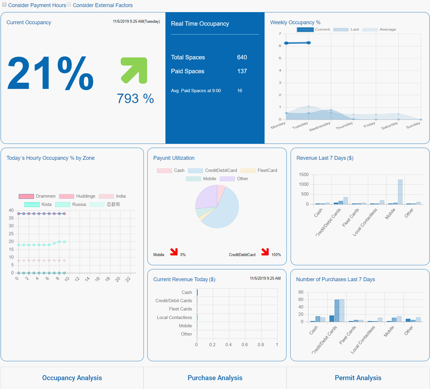
The top panel of the Dashboard shows the Real Time Occupancy data.
The percentage figure on the left shows the current ratio between the paid for spaces and the total number of spaces. I.e. 10% shows that 10% of the spaces are paid for.
| Note: There is a major difference between "Spaces paid for" and "Space in use" as we only know about the purchases listed in WebOffice we can only know about the number of spaces paid for. To be able to know about the spaces in use we should have access to sensors in the parking spaces. This is currently not implemented in WebOffice. |
The arrow in the same frame depicts the current increasing/decreasing trend per hour of the ratio between the paid spaces at the current hour and the average paid parking spaces within the last five weeks for this same hour.
The blue middle section shows the total available spaces at the current hour, the currently paid spaces, and the average paid spaces within the last five weeks for the same hour. The number of spaces listed depends on the current status of the spaces. Only the "open" spaces are taken into account.
The line chart to the right with three curves, represents the current week’s real time occupancy per day, in comparison with the last week’s daily occupancy average, and the daily average occupancy over the last five weeks.
Middle panel section
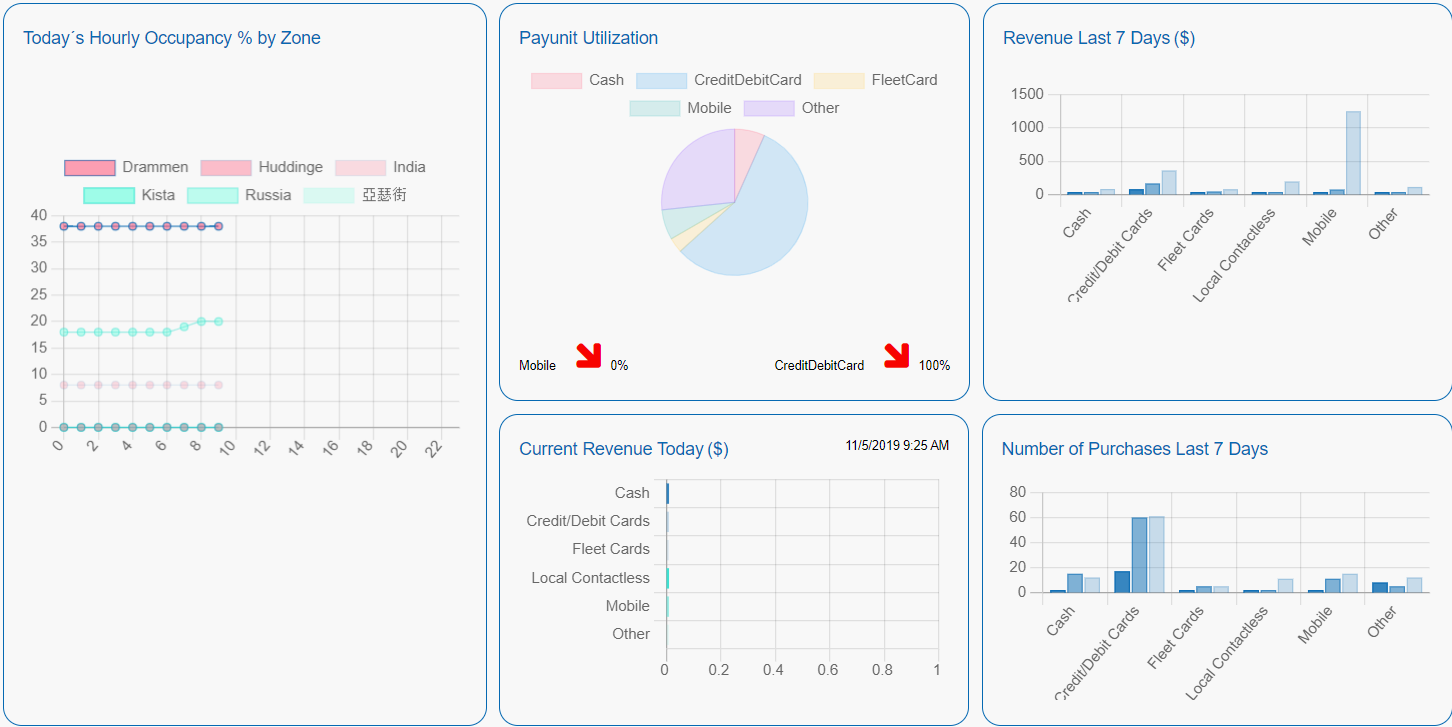
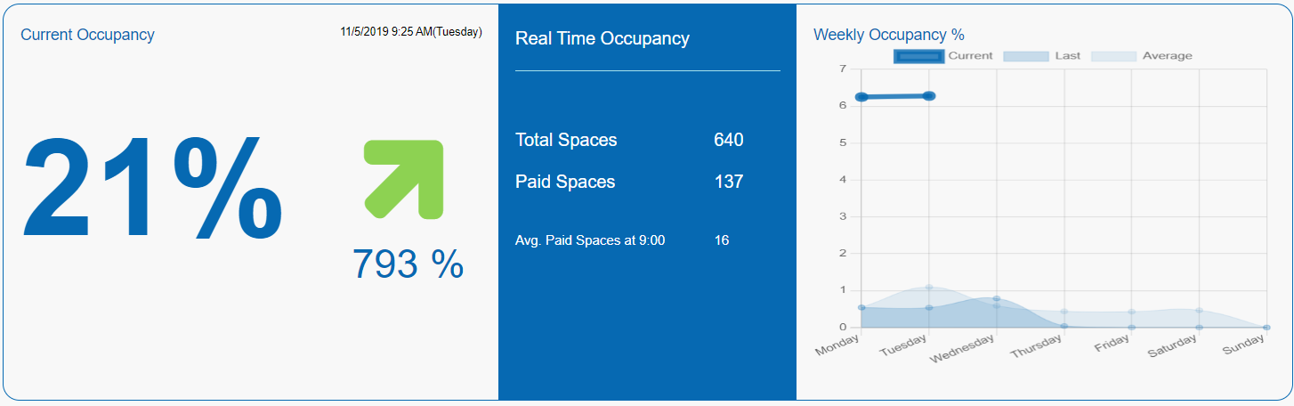
The "Current Occupancy % by Zone" line chart, located at the bottom left, presents the current day’s hourly occupancy curves of the three most occupied and the three most unoccupied parking zones.
The "Payunit Utilization" panel with the pie chart represents the average percentage ratio of the various payment method utilization for the last seven days. The two arrows below the chart indicate the most increasing and decreasing payment methods.
The "Current Daily Revenue" horizontal bar chart, located below the pie chart, presents the current day’s revenue sorted out by a payment method.
The "Revenue last 7 days" bar chart, located to the right of the pie chart represents the last seven-day revenue sorted by the payment method in comparison with the previous week, and the last four-week average. The bars are grouped by the type of payments. E.g. all the fleet card transactions are grouped together in one figure.
Finally, the "Number of purchases Last 7 days" bar chart, located at the bottom right, represents the last seven-day purchase count, sorted out by the payment method, in comparison with the previous week, and the last four-week average.
The vertical bar charts display the current value in dark blue, the last weeks values in a lighter blue shade and the last 5 weeks average in the light blue shade.
Lower panel section
The lower panel section contains links to specific analysis pages
•Permit Analysis